Pantone's 2021 Color of the Year
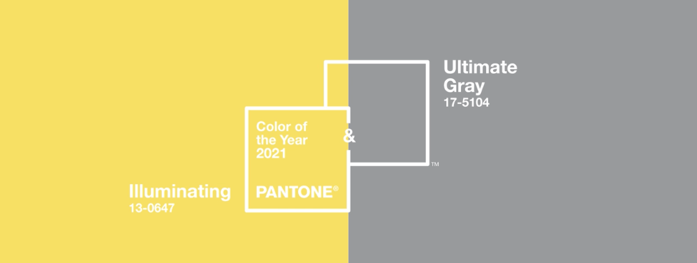
Just like Crayola created the standards of color when we were kids, Pantone creates the standards of color in the professional creative world. This year's Pantone Color of the Year is actually two colors, with good reason.
As designers, we take the psychology of what a color makes us feel, combine them with other colors, and we create a graphic or image that conveys feelings. Colors are such a powerful, sometimes sneaky way to make a viewer feel something specific. It's all a very intentional combination of decisions by the designer.
What's in a color?
Rolling into 2021 each person in this world has their sights set on something brighter. It's a key part of being human. Hanging on the idea that things are going to be better. Get better. What better color to select than Illuminating? It strikes a pure and chipper note with the eye that resonates with the mind, body and soul. Just like the action of the sun, this color ushers in feelings of warmth to everyone who sees it.
That leaves us with Ultimate Gray. The color of a sturdy rock, made to withstand time and weather. This ushers in a feeling of steadiness and a deep sense of composure. A sense that things are being held together. Unshakeable. This is exactly what people need coming off of a swirling year of chaos.
How Pantone selects their colors
Pantone doesn't just pull these colors out of a hat. They are strategically selected by the Pantone Color Institute based on trends and influencers across industries around the world. The two colors selected are the perfect blend to showcase how different elements can come together to support each other.
The Pantone Color Institute is responsible for creating global color trends and they partner with major brands to help them use specific colors in their design. The right color is powerful and has the ability to evoke emotion, so having the job of selecting the most influential colors of the year is a pretty big deal.
So, take these colors and use them. Play with them. Get inspired by them. Pantone selected them for a reason.
Their mission is to help do good by inspiring people with color. So the color experts at Pantone did just that this year. They combined two colors to convey a message of hope and resilience. And that's a message we can get behind.
Post published on
Share This Article
MORE FROM OUR BLOG